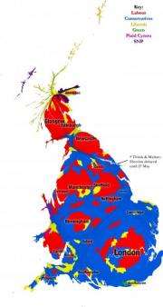
Unique map shows UK general election results in new light

A unique map of the UK, showing alternative images of the General Election results, has been created by researchers at the University of Sheffield. The image, which is based on population data, shows how many people are represented by each political party.
The map was created by Benjamin Hennig, a postgraduate researcher at the University's Department of Geography. Unlike conventional maps or the commonly used constituency maps, it puts human beings as the focus to tell a different story of the election results.
Geographical maps of the results can appear to overemphasise the vote of rural areas, as the physical size of these constituencies can be much larger than those in urban areas. The increasingly used constituency maps overcome this problem, by distorting land area in favour of a representation of seats in parliament, using one shape per constituency.
The new map created by the researchers goes one step further, by using a gridded population cartogram, with each grid cell sized according to the number of people who live there. By reflecting where people live in the country, the map enables us to see at a glance the number of people who are now represented by each party after the General Election on 6 May 2010.
Ben said: "We designed this map to provide an additional element to the existing election maps. When analysing the election results, the map provides an alternative angle by showing the real dimension of the people's vote in this election. All existing mapping approaches provide a very different perspective on the election outcome. With this new population projection we can understand much better the relation of population density and voting preferences."
More information: To view the election maps and the Worldmapper website, please visit: benhennig.postgrad.shef.ac.uk/
Provided by University of Sheffield


